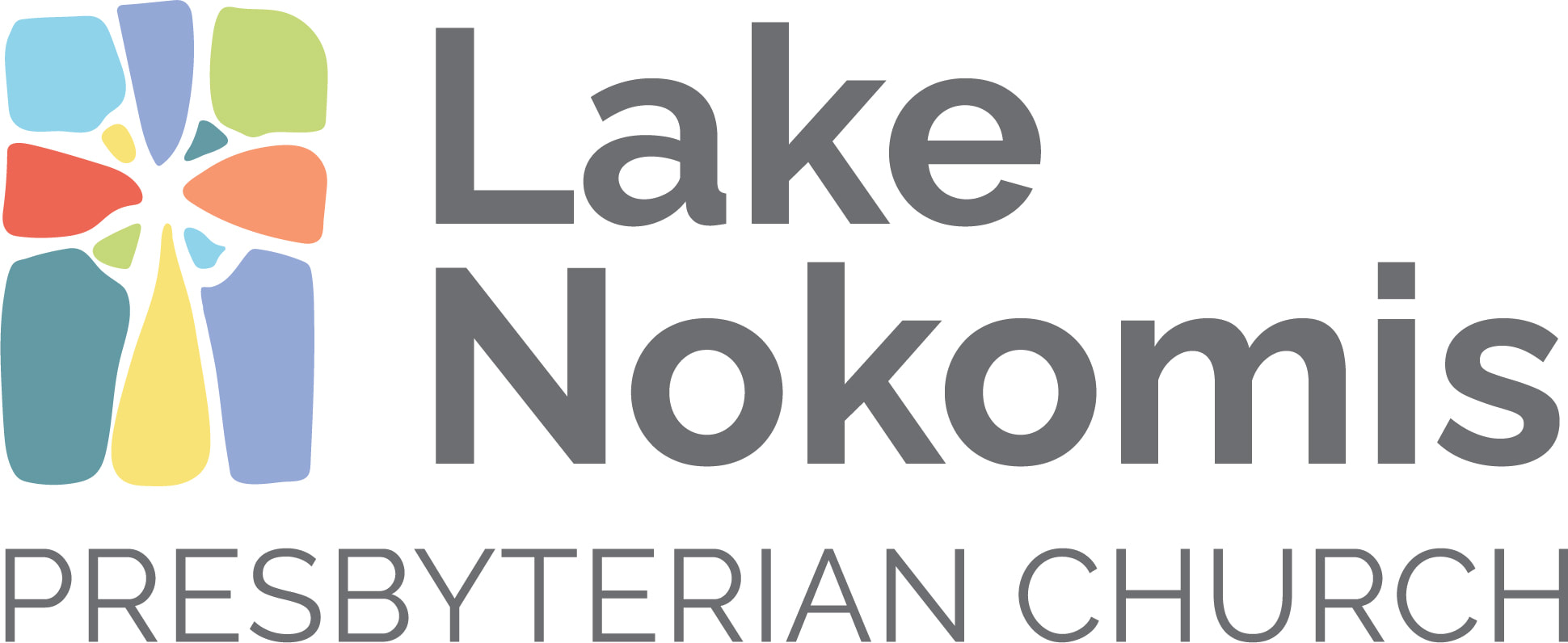
We have a new logo!
Thank you to Erin D. for leading session through and keeping our feet to the fire, and to graphic designer Selena Koosman for creating something wonderful that captures the heart of LNPC beautifully.
Here's what we love about this logo:
The cross is in the space in between, just like the presence of Christ and the faith that holds us. As we like to say, "We meet Jesus who is with and for us, when we are with and for each other." It's also a picture of "assuming the stance of least resistance" - living with openness, and cultivating openness to God and one another. There is no boundary around the outside, and no lines dividing in between - the shapes and colors are different and the image is formed by all of them pulled together. It's a visual representation of "whenever we gather together, God meets us". There is a feel of stained glass - broken and beautiful, with light shining through, and the shapes feel organic and natural, not rigid or perfect. It nods to the Celtic cross on our building, and in our previous logo, without being a replica. We come as different people to create a beautifully colorful community, and encounter God in the energy in between. This logo depicts that.
What else do you notice? What do you love about it?


 RSS Feed
